

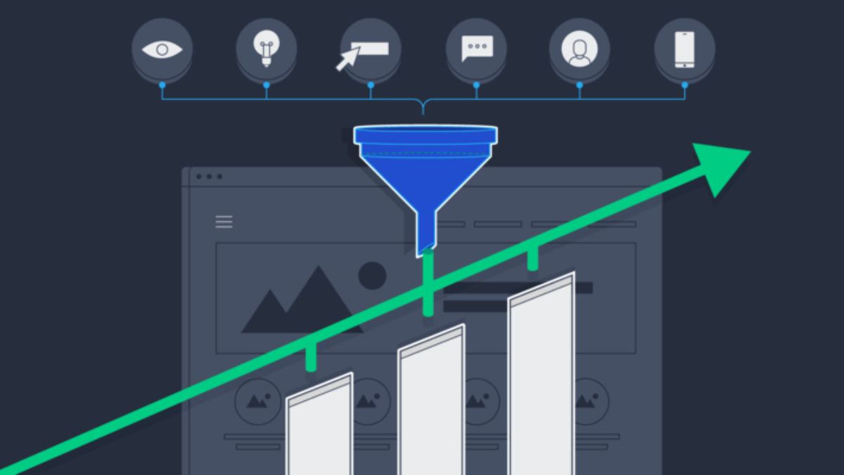
I once watched a client spend a small fortune on ads that sent people to a landing page with five different buttons, a slideshow that autoplayed, a headline that said “Welcome to Our World of Excellence,” and a contact form with fourteen fields. When I asked what she wanted visitors to do, she said, “Buy, subscribe, book a call, follow us, and read the blog.” That was the problem. The page asked for everything, so nobody did anything.
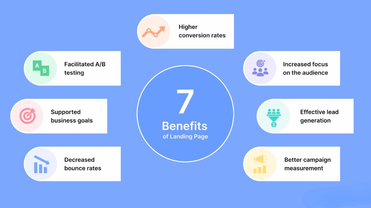
With ad costs rising, tracking getting fuzzier, and AI answers sending visitors who arrive with very specific questions, your landing page matters more than almost any other asset. If it converts better, every ad dollar, email, and social post works harder. If it doesn’t, you’re paying for traffic that leaks out the bottom.
In this guide, I’ll walk through landing page conversion basics for small businesses: ten practical fixes you can make without a designer or a developer, plus a simple testing routine.
Why Landing Pages Matter More Now
- Ad costs keep climbing, so conversion rate has become a major lever. Benchmarks show Meta’s cost per lead rising while platforms automate away manual controls.
- Visitors from AI answers arrive informed. When people ask long, specific questions, they expect your page to answer them quickly.
- Mobile dominates. Social and short-video traffic is largely on phones.
- Trust is fragile. Shoppers compare options quickly, and surveys show many still start with a site’s own search bar rather than an AI assistant.
Here’s the truth: you can often improve results faster by fixing your landing page than by changing your targeting.
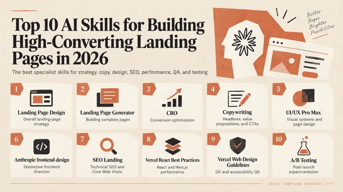
Fix 1: One Page, One Goal
Decide the single action you want, such as “book a call,” “buy this product,” or “download the guide.” Then remove or de-emphasize everything else.
- One primary call-to-action button (repeated, but always the same action)
- Minimal navigation, or none, on dedicated campaign pages
- No competing offers
Fix 2: Write a Headline That Matches the Ad or Link
People click with an expectation. Your headline should confirm it within a second.
- Match the promise. If the ad says “free bookkeeping checklist,” the headline should too.
- State the benefit, not the company name.
- Be specific: “Cut your invoicing time in half with a simple three-step system” beats “Better solutions for your business.”
- Add a subheadline that explains who it’s for and what happens next.
Fix 3: Make the Page Fast on Mobile
Slow pages lose people before the headline loads.
- Compress images and avoid giant files.
- Remove unnecessary scripts, pop-ups, and widgets.
- Use a reliable host and caching.
- Test your page on a real phone, on a normal connection, not just on fast Wi-Fi.
Fix 4: Lead With Proof
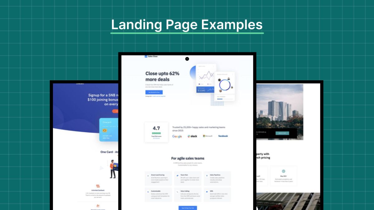
Visitors want evidence that you can deliver:
- Customer testimonials with names and photos (with permission)
- Star ratings and review counts from trusted platforms
- Specific results: numbers, before-and-after, and short case studies
- Logos, press mentions, or credentials, if real and relevant
- Guarantees or clear return policies
Never fake testimonials, inflate numbers, or make claims you can’t back up.
Fix 5: Answer the Obvious Questions Fast
Visitors arriving from long, detailed searches often have specific concerns:
- What exactly do I get?
- How much does it cost?
- How long does it take?
- Who is this for, and who isn’t it for?
- What happens after I click?
- What if it doesn’t work?
Add a short FAQ near the call to action. Clear answers reduce hesitation and also help search and AI systems understand your page.
Fix 6: Use Clear, Benefit-Focused Copy
- Write in plain language. Short sentences and short paragraphs.
- Focus on outcomes (“sleep through the night”) instead of features (“patented foam layers”).
- Speak directly to the reader using “you.”
- Use bullet points for scanning.
- Include one or two relatable details from real customers.
If you use AI to draft copy, edit it into your own voice and verify every claim.
Fix 7: Design a Call-to-Action That’s Impossible to Miss
- Use action words with a benefit: “Get my free checklist,” “Book my strategy call,” “Start my trial.”
- Make the button stand out with contrast and space.
- Place it above the fold and again after key sections and at the end.
- Reduce friction near the button: short reassurance like “No credit card required” (only if true).
Fix 8: Shorten Your Forms
Every extra field costs you conversions.
- Ask only for what you truly need now. Often that’s a name and email.
- Use clear labels and helpful error messages.
- Make forms easy to complete on a phone, with proper keyboard types and autofill.
- Explain what happens after submission, and state how you’ll use their information.
Fix 9: Build Trust and Handle Privacy Properly
- Show contact details, a real business name, and, where relevant, a physical address.
- Link to a clear privacy policy and terms.
- Use secure checkout and recognizable payment options.
- Follow privacy laws and consent rules that apply to you and your visitors, including how you use tracking tags.
- Be transparent about pricing and fees. Surprise costs kill trust.
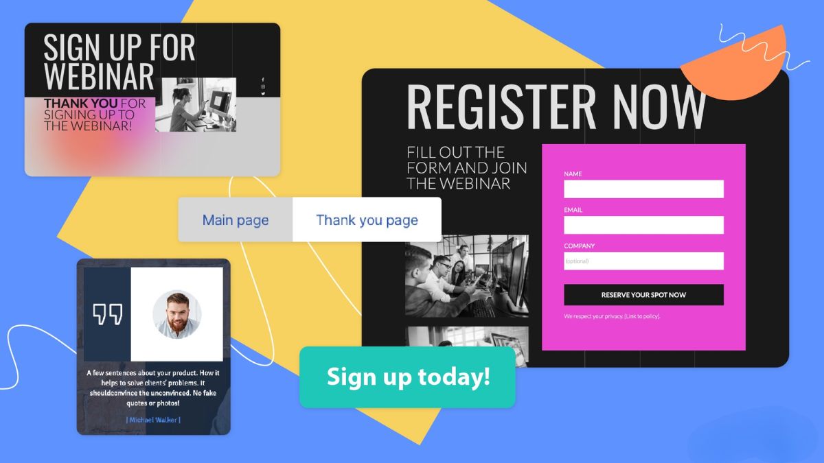
Fix 10: Test and Improve (Without Overcomplicating It)
A simple testing routine:
- Pick one element to test: headline, button text, image, or form length.
- Write a hypothesis: “If we make the headline more specific, more visitors will click because the offer is clearer.”
- Run the test long enough to gather meaningful data. With small traffic, test big changes rather than tiny tweaks.
- Measure the right metric: conversions, not just clicks.
- Keep notes of what you learned.
If you don’t have enough traffic for formal A/B tests, compare before-and-after results over a few weeks and watch your trend lines.
Measure What Matters
- Conversion rate: visitors who complete the action divided by total visitors
- Bounce rate and scroll depth: where people leave
- Time to first interaction
- Form abandonment
- Traffic source differences: pages may convert differently for ads, email, and search
- Self-reported source: ask people how they found you
Watch session recordings or heatmaps if you can, to see where people hesitate.
Quick Wins to Try This Week
- Replace your vague headline with a specific benefit.
- Add three real testimonials near your main button.
- Remove your top two distracting links.
- Cut one field from your form.
- Compress your largest image.
- Add a short FAQ.
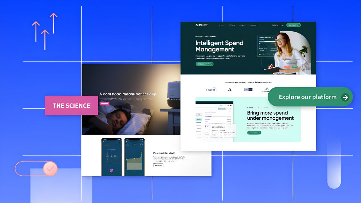
Mistakes to Avoid
- Sending ad traffic to your homepage.
- Too many calls to action.
- Vague headlines.
- Slow mobile pages.
- Hiding the price or key details.
- Fake urgency and fake scarcity.
- Not testing after changes.
Your 14-Day Landing Page Tune-Up
- Days 1-2: Define the one goal. Write down the exact promise in your ad or link.
- Days 3-4: Rewrite your headline and subheadline.
- Days 5-6: Add proof: testimonials, ratings, and one case study.
- Days 7-8: Speed up the page and check mobile layout.
- Days 9-10: Shorten the form and clarify the button.
- Days 11-12: Add an FAQ and check privacy and trust details.
- Days 13-14: Launch one test and set a review date.
Build Landing Pages Into a Complete System
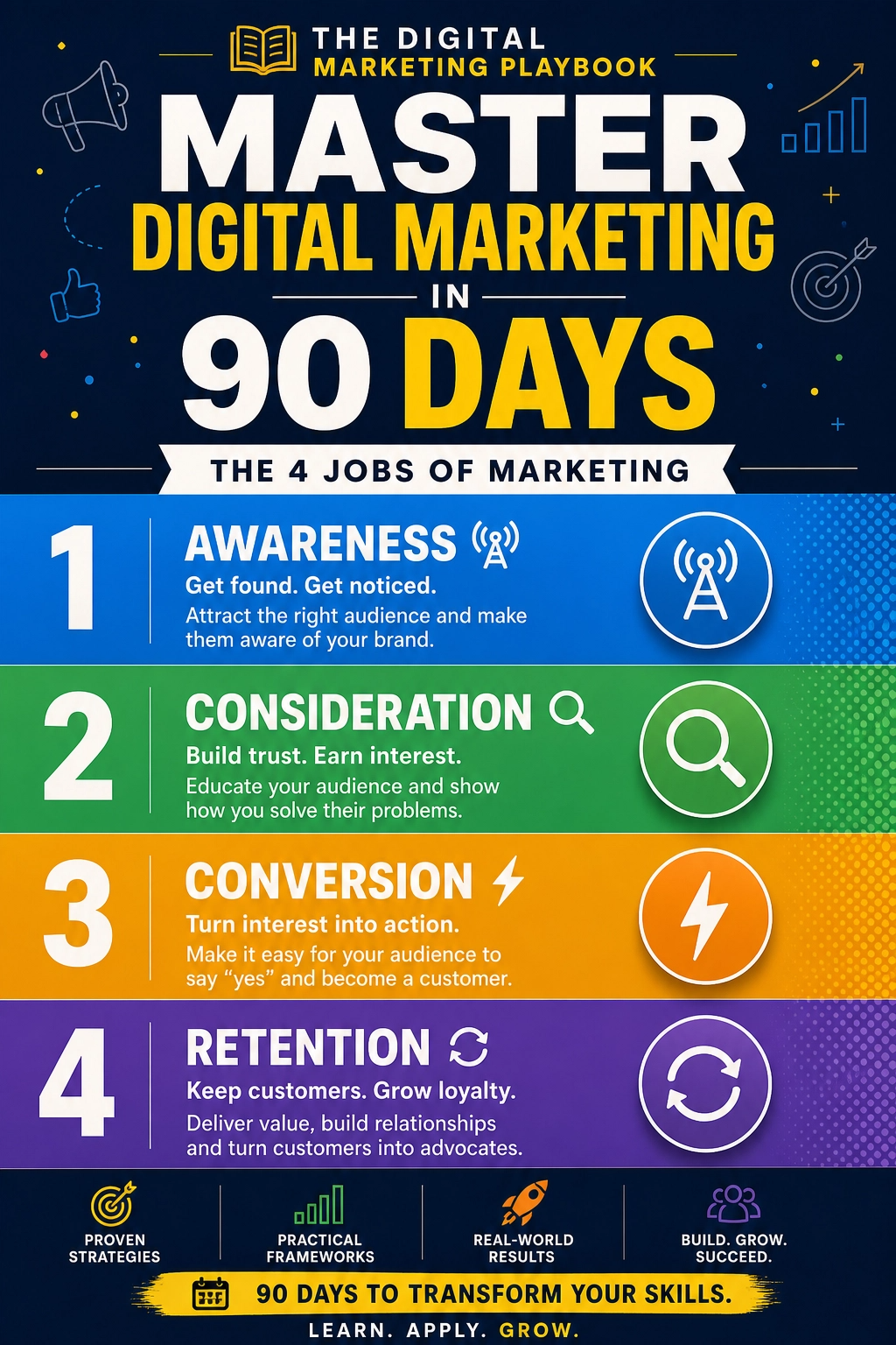
A great landing page works best as part of a plan that includes traffic, email follow-up, and measurement. If you’d like a step-by-step guide to building a complete marketing system, take a look at my ebook:
The Digital Marketing Playbook
Trust me, a better landing page is the cheapest way to get more from every campaign.
Final Thoughts
Before you increase your ad budget, fix the page where your visitors land. Give it one goal, a clear headline, real proof, honest answers, a fast mobile experience, and a short form. Then test, learn, and improve. Small changes to a good page can quietly multiply the return on everything else you do.





Leave a Reply