How to Make Digital Stickers in Canva: A Complete Beginner’s Guide
Did you know that the digital sticker market on Etsy grew by an incredible 127% in 2023? I remember when I first started creating digital stickers – I was completely overwhelmed! But here’s the exciting part: with tools like Canva, you don’t need expensive software or years of design experience to create beautiful stickers that sell. In fact, some of the top digital sticker sellers on Etsy started their journey using just Canva! Let me walk you through exactly how to create your first digital stickers, using the same techniques that helped me build my own successful digital sticker business.
Getting Started with Canva for Digital Sticker Creation
I remember when I first discovered I could make digital stickers in Canva – it completely transformed my digital planning game! Let me share what I’ve learned from creating hundreds of stickers over the years.
First things first – getting started with Canva is actually super easy, and the best part? You can begin for free! I always tell my students to start with the free version since it has plenty of features to create amazing stickers. Head over to Canva.com and sign up with your email or Google account. Pro tip: if you’re a student or educator, don’t forget to check if you qualify for Canva Education – I wish someone had told me this sooner!
When you first open Canva, I know it can feel a bit overwhelming. Trust me, I spent a good hour just clicking around when I started! The workspace is actually pretty straightforward once you know what you’re looking at. On the left side, you’ll find all your design elements, templates, and uploads. The main canvas is in the center (obviously!), and your top bar has all those essential editing tools you’ll need.
Now, here’s something crucial I learned the hard way – setting up the right canvas size from the start will save you so much headache later! For digital stickers, I typically start with a 500×500 pixel canvas. Why? Because it gives you enough room to work with details while keeping the file size manageable. To create a custom size, just click “Create a design” and then “Custom size” – super simple!

Speaking of essential features, let me share the game-changers for sticker creation in Canva. The Elements section is your best friend – it’s where you’ll find shapes, lines, and graphics to build your stickers. The background remover tool (if you have Canva Pro) is absolutely incredible for creating those clean, professional-looking stickers. Even without Pro, though, you can still create stunning stickers using transparent backgrounds.
One thing that took me forever to figure out was the power of groups and layers in Canva. You can actually group elements together to move them as one unit – this is super helpful when you’re creating complex stickers with multiple parts. Just select multiple elements and hit Group in the top menu. I can’t tell you how many times this feature has saved me from losing my mind trying to align everything perfectly!
Remember, the magic of sticker creation isn’t just in the tools – it’s in how you use them. I started with simple shapes and gradually worked my way up to more complex designs. Don’t feel like you need to master everything at once! Start with basic shapes, play with colors, and most importantly, have fun with it. That’s how you’ll develop your own unique style.
The coolest part about using Canva for stickers? You can easily export your creations as PNGs with transparent backgrounds – perfect for digital planning or selling on platforms like Etsy. Just make sure to check that transparency box when you download!
Essential Tools and Elements for Digital Sticker Making
Let me tell you about my journey discovering the essential tools for making digital stickers – it’s been quite the learning experience! When I first started, I was completely overwhelmed by all the options. Now, after creating thousands of stickers, I’ve got my go-to toolkit down to a science.
First, let’s talk about the absolute must-have elements in Canva. You know what’s funny? I spent weeks trying to create complex designs before realizing that the basic shapes tool is actually the secret weapon of sticker making! The circle, square, and triangle tools might seem boring, but trust me – they’re the building blocks of almost every sticker I create. I use them to make everything from simple dots and flags to complex planner icons.
One thing that really changed my sticker game was discovering how to build a proper color palette. Here’s a trick I learned from a fellow sticker designer: start with just three colors that work well together, then use the color picker tool to create lighter and darker shades of each. This way, your stickers look cohesive but not boring. I love using Canva’s built-in color palette suggestions, but I also keep a Pinterest board of color combinations that catch my eye during my daily scrolling.
Typography was honestly my biggest struggle when I started! I would spend hours trying different fonts until I finally learned this simple rule: stick to no more than two fonts per sticker set. Usually, I’ll pick one decorative font for headers or emphasis, and one clean, simple font for any additional text. My go-to combination is often a script font paired with a sans-serif – it just works every time! Quick tip: if you’re making functional planner stickers, make sure your text is readable at smaller sizes. I learned that one the hard hard way after creating a whole batch of beautiful but completely illegible appointment stickers!
Now, let’s talk about those basic design elements that make such a huge difference. Lines and borders are absolute workhorses in sticker design – I use them constantly! The shape tools in Canva are fantastic, but here’s a little secret: I often combine basic shapes to create more complex designs. For example, overlapping circles with rectangles can create those trendy speech bubbles everyone loves. And don’t even get me started on the power of the duplicate tool – it’s a game-changer for creating consistent design elements across your sticker sets!
Something I wish someone had told me earlier is how important white space is in sticker design. When I first started, I tried to cram as many elements as possible into each sticker. Now I know that giving designs some breathing room makes them so much more usable and professional-looking. It’s like that saying – sometimes less really is more!
I’ve found that having a good organization system for your elements is crucial. I create folders for different types of elements – one for frames, one for icons, one for decorative elements. This saves so much time when you’re in the middle of a design flow. Nothing worse than losing momentum because you can’t find that perfect arrow you used last week!
Speaking of organization, one last pro tip: save your most-used element combinations as templates. If you find yourself repeatedly creating the same basic shapes for checklist stickers or headers, group them together and save them. This has literally cut my design time in half!
Step-by-Step Digital Sticker Creation Process
Let me walk you through my digital sticker creation process – I’ve definitely refined this over time through plenty of trial and error!
When I first start a new sticker design, I always begin with setting up my canvas correctly. I learned pretty quickly that 500×500 pixels works great as a starting point for most digital stickers. But here’s a pro tip I picked up: I actually create my designs slightly larger than I need them, usually around 800×800 pixels. Why? Because it’s way easier to work with the details when you’re zoomed in, and you can always scale down without losing quality. I can’t tell you how many times I had to start over before figuring this out!
Selecting and customizing shapes is where the real fun begins. I always start with basic shapes as my foundation – they’re like the skeleton of your sticker. Here’s something that took me forever to figure out: instead of trying to find the perfect pre-made shape, it’s often better to combine simple shapes to create exactly what you want. For example, I’ll use a circle for the base of a decorative element, then add smaller circles or rectangles to create detail. The alignment tools are your best friends here – I use the center alignment option constantly to keep everything perfectly positioned.
Now, about colors – this is where I see a lot of beginners struggle (myself included when I started!). Instead of just picking random colors that look nice, I’ve learned to create a proper color strategy. I usually start with 2-3 main colors, then create variations using the color picker. A game-changing tip: use the eyedropper tool to pull exact colors from your brand palette or inspiration images. And don’t forget about gradients! They can add such a beautiful, modern touch to your stickers. I love using subtle gradients to create dimension – just keep the contrast gentle unless you’re going for a bold look.
Typography was honestly my biggest challenge at first. What worked for me was creating a “type hierarchy” system. For example, if I’m making planner stickers, I’ll use a bold sans-serif font for headers (usually around 24pt), a medium weight for subheaders (18pt), and a light weight for details (12-14pt). The key is consistency – once you find a combination that works, stick with it across your whole sticker set.
Creating shadows and depth really elevates your stickers from looking flat to professional. Here’s my foolproof method: duplicate your main shape, make it slightly larger, offset it just a bit behind the original (usually down and to the right), and change the color to a darker shade. Then reduce the opacity to around 30-40%. It took me some experimenting to get this right, but now it’s second nature!
For adding texture and details, I’ve learned that less is often more. I used to go overboard with patterns and decorative elements until I realized they were making my stickers too busy. Now I focus on subtle details – maybe a light pattern overlay at 10-15% opacity, or strategic placement of small dots or lines. One trick I love is using the shape builder tool to create custom patterns – it’s amazing what you can do with just a few repeated elements!
A final tip that revolutionized my workflow: always organize your layers as you go! I name each layer group clearly and keep related elements together. Trust me, when you’re trying to make quick adjustments later, you’ll thank yourself for staying organized. I used to skip this step and would spend ages trying to select the right element to edit.
Remember, every sticker designer has their own process, but these steps have consistently worked for me in creating professional-looking digital stickers that my customers love. Don’t be afraid to experiment and adapt this process to find what works best for you!
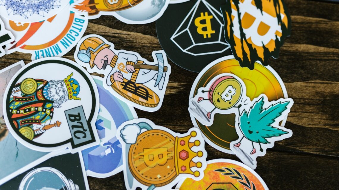
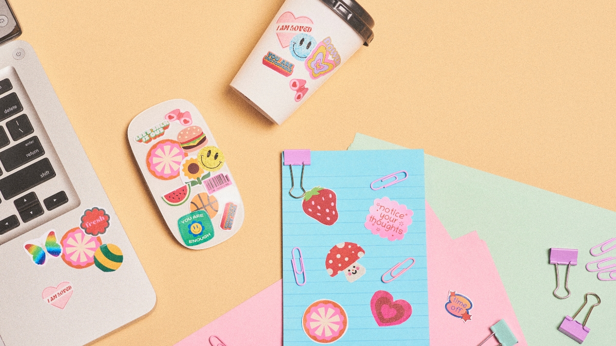
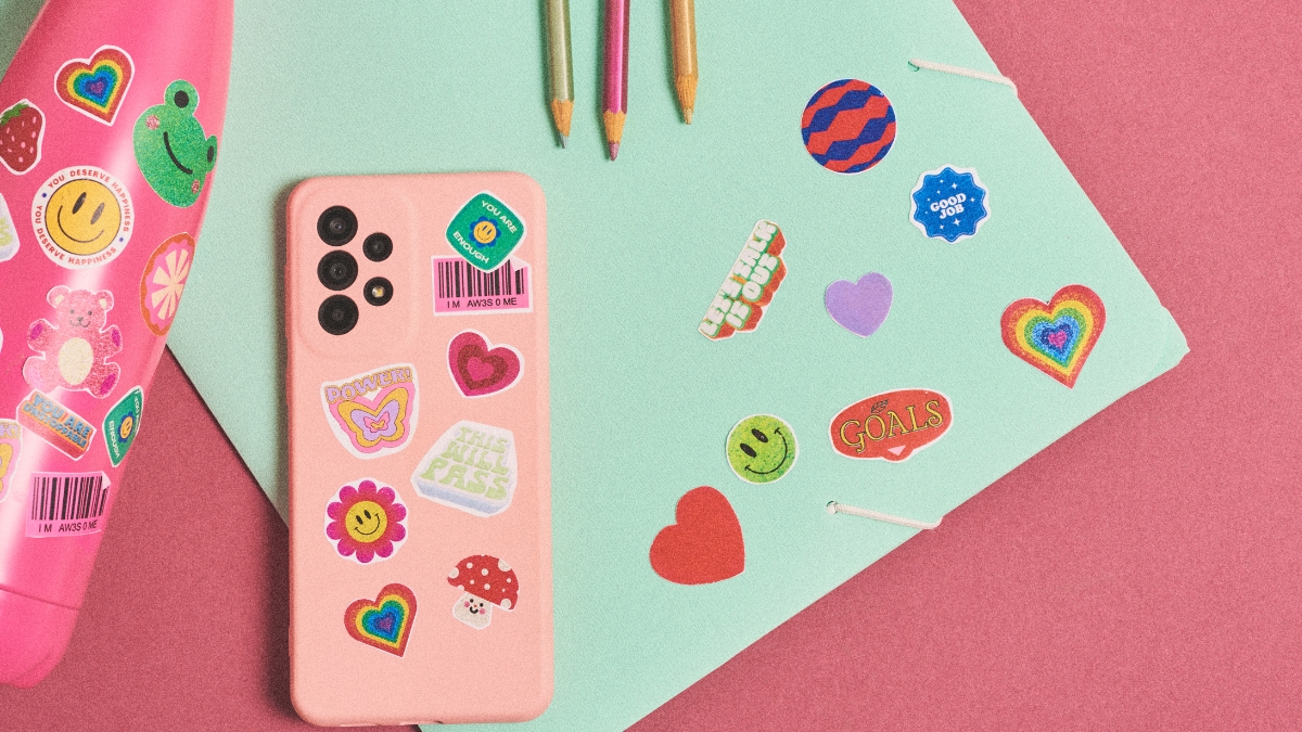
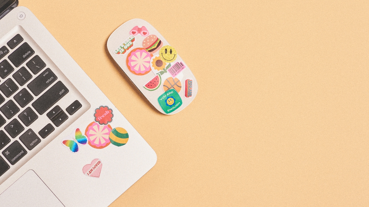
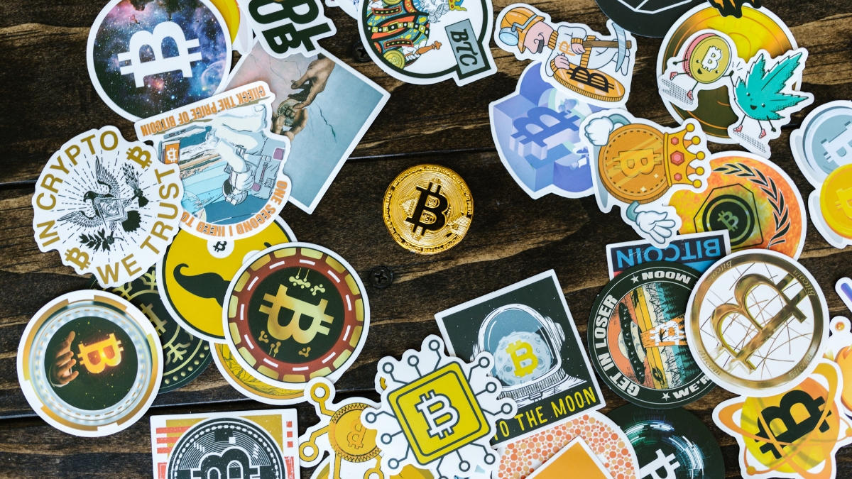
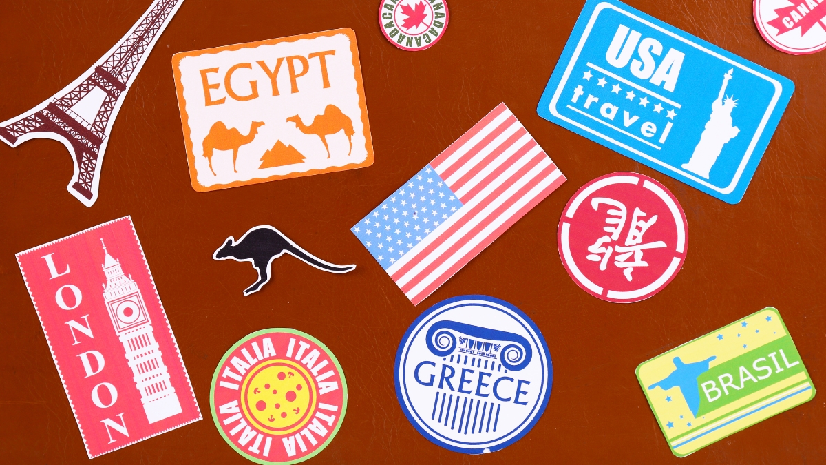
How to Make Different Types of Digital Stickers
When I first dove into making different types of digital stickers, I had no idea there were so many possibilities! After years of experimenting, let me share what I’ve learned about creating various sticker styles that people actually want to use.
Let’s start with decorative elements and icons – these are probably my favorite to make! I discovered that the key to creating eye-catching decorative stickers is to start simple and build up layers. For example, when I make floral elements, I begin with basic petal shapes, then add layers of detail like centers, leaves, and subtle shadows. One trick I stumbled upon: using the transparency tool to create different depths in your design makes even simple shapes look more sophisticated. Who knew that making a flower petal 80% transparent could add such beautiful dimension?
Creating functional planner stickers was a game-changer for my own organization (and eventually my Etsy shop!). The secret here is standardization. I learned to create consistent sizes for different elements – like making all my checkbox stickers exactly 0.5 inches wide, or ensuring all my header stickers fit perfectly in standard planner spaces. Something that took me way too long to figure out: always test your functional stickers at actual size! I once created an entire set of beautiful appointment stickers that were completely unusable because they were too big for standard planners.
Quote and typography stickers taught me a lot about white space and balance. Here’s a pro tip that transformed my text-based stickers: create a visual hierarchy by varying font sizes and weights within the same design. I typically use three sizes – large for the main word or phrase, medium for supporting text, and small for any additional details. And please learn from my mistake: always, always check your spelling! I once created 100 quote stickers with a typo before anyone noticed.
Bullet journal elements require a special touch because they need to be both functional and aesthetically pleasing. I’ve found that simple, clean lines work best for things like habit trackers and monthly layouts. One of my most popular designs came from combining minimalist boxes with tiny decorative corners – just enough detail to make them special without overwhelming the actual journaling space.
When it comes to seasonal and themed stickers, planning ahead is crucial. I learned to start creating holiday stickers at least 3-4 months before the actual holiday (because that’s when people start searching for them!). My best-selling Christmas stickers were actually designed in August! For themed sets, I create a mood board first and pick a color palette that tells a story. For example, my autumn-themed stickers use a mix of warm oranges and deep greens, with little pops of burgundy for interest.
Here’s something really important I’ve learned: consistency is key when creating sticker sets. Whether you’re making decorative or functional stickers, maintain the same style, color palette, and general aesthetic throughout the set. I keep a template with my core design elements and color codes, so every new sticker matches perfectly with the set.
I also discovered that testing different color variations of the same design can lead to more sales. What works for one person might not work for another, so I usually create each design in 2-3 different color schemes. My pastel versions almost always sell as well as the bright ones!
Remember to consider your target audience when designing different types of stickers. My minimalist planner stickers tend to appeal to busy professionals, while my more decorative designs are popular with creative journalers. Understanding these preferences has helped me create stickers that people actually want to buy and use.
Creating Digital Sticker Collections and Sets
Looking back at my sticker-making journey, creating cohesive collections was definitely one of the bigger challenges I faced! There’s such a difference between making individual stickers and designing sets that work together harmoniously. Let me share what I’ve learned about building collections that really work.
The secret to designing cohesive sticker packs starts with planning – something I totally ignored when I first started! Now I always create a mood board before starting any collection. I gather inspiration images, color schemes, and even make quick sketches of potential designs. This step has saved me countless hours of redesigning later. One time, I jumped straight into creating a tropical-themed set without planning, and halfway through, I realized none of my designs really matched. Talk about a face-palm moment!
Color scheme consistency is absolutely crucial for professional-looking sets. Here’s my tried-and-true method: I select 4-5 core colors for each collection and create what I call a “color recipe.” This includes the exact hex codes and different opacity variations I’ll use throughout the set. For example, in my bestselling pastel planner collection, I use each main color at 100%, 70%, and 40% opacity to create depth without introducing new colors. Having this color recipe has been a game-changer for maintaining consistency across hundreds of stickers.
Theme development was something I really had to work on. I used to just create random stickers I thought looked cute, but they didn’t tell a cohesive story. Now I approach each collection with a specific theme in mind. Take my “Cozy Winter” collection – every single element, from the coffee cups to the snowflakes, supports that cozy winter vibe. I even create a little story around each theme. What would someone using these stickers be doing? What kind of mood do I want to create?
Size variations were another lesson learned the hard way! I remember creating this gorgeous set of decorative elements, only to realize users needed different sizes for different purposes. Now I create each design in at least three sizes – small for subtle accents, medium for regular use, and large for statement pieces. But here’s the trick I discovered: instead of just scaling everything up or down, I adjust the details for each size. Smaller versions might have simplified details, while larger versions can handle more intricate elements.
One thing that really improved my collections was creating “anchor pieces” – these are the main designs that define the style of the whole set. I usually create these first and then build complementary elements around them. For instance, in my botanical collection, I started with the main floral designs, then created coordinating leaves, stems, and smaller accent pieces that matched their style.
Organization is key when working on collections. I create a master template for each set with designated spaces for different types of stickers – decorative elements in one section, functional pieces in another, text elements in their own area. This helps ensure I’m including a good mix of everything users might need.
Something else I learned through trial and error: include some versatile, neutral pieces in every collection. Even in themed sets, users appreciate having some basic elements that can work year-round. In my Halloween collection, for example, I included some basic black and orange geometric shapes that could be used beyond the spooky season.
I also pay special attention to making sure functional stickers work together visually while still being practical. Things like headers, checkboxes, and flags need to coordinate aesthetically but also need to fit standard planner sizes. I actually print and test every functional sticker now before finalizing the design – learned that lesson after creating a whole set of checklist stickers that were just slightly too big for standard planners!
Exporting and Formatting Your Digital Stickers
Common Digital Sticker Design Mistakes to Avoid
Let me tell you about some mistakes I’ve made (and learned from!) in my digital sticker design journey. Trust me, I’ve made pretty much every mistake possible, and now I can help you avoid them!
Resolution and sizing issues were my biggest headaches when I first started. I remember creating this beautiful set of planner stickers, only to find they were pixelated when scaled up! The solution seems obvious now: always start with a larger size than you think you’ll need. I work at 800×800 pixels minimum, even for small stickers. Another rookie mistake I made was inconsistent sizing within collections. Now I use a template grid to ensure all similar stickers (like checkboxes or headers) are exactly the same size.
Color compatibility was another learning curve. I once created this gorgeous set of stickers that looked amazing on my screen, but when customers tried to use them, the colors looked completely different on their devices! Here’s what I learned: stick to web-safe colors when possible, and always test your designs on different devices. I now have a little testing routine where I check my designs on both my phone and tablet before finalizing them.
Design overcrowding – oh boy, was I guilty of this one! When I first started, I tried to cram every cute detail possible into each sticker. The result? Cluttered, unusable designs that looked messy when scaled down. Now I follow the “less is more” rule. I ask myself: “Does this extra detail actually add value to the sticker?” If not, it goes! One of my best-selling collections is actually my most minimalist one.
Export format errors taught me some hard lessons. I once sent out an entire collection without checking the transparent backgrounds, and every sticker had a white box around it! Now I have a pre-export checklist:
- Check transparency on both light and dark backgrounds
- Verify PNG format (never JPG for stickers!)
- Test the file size isn’t too large (aim for under 500KB per sticker)
- Open the exported file to verify quality
Something else I learned the hard way: always preview your stickers at actual size. What looks great at 800×800 pixels might be completely illegible when scaled down to normal planner size. I now test all my text-based stickers at their intended use size to ensure readability.
The biggest mistake I see designers make (and I was guilty of this too) is not considering how the stickers will actually be used. Functional stickers need to be practical first, pretty second. I created these elaborate checkbox stickers once that looked amazing but were too complex to actually use in a planner. Now I always think about functionality before adding decorative elements.
Let me share a recent lesson: color bleeding in exports. I noticed some of my stickers had slight color variations around the edges when exported. The fix? Adding a tiny 1-pixel buffer around detailed elements. This small change made such a big difference in the final quality!
Remember, every mistake is a learning opportunity. I keep a “design lessons” journal where I document issues I’ve encountered and their solutions. It’s amazing how many times I’ve referred back to it! And don’t be afraid to ask for feedback – some of my best improvements came from customer suggestions.
Creating digital stickers in Canva is an exciting journey that anyone can master with practice and patience. Remember, every successful digital sticker creator started exactly where you are now. Take what you’ve learned today, experiment with different designs, and don’t be afraid to develop your unique style. The digital sticker market is growing every day, and there’s plenty of room for your creativity! Ready to start designing? Your first digital sticker is just a few clicks away!


You May Also Like

How to Get Google AdSense Approval in 2025: Complete Step-by-Step Guide

How to Sell Educational Worksheets Online: A Complete Guide for Teachers